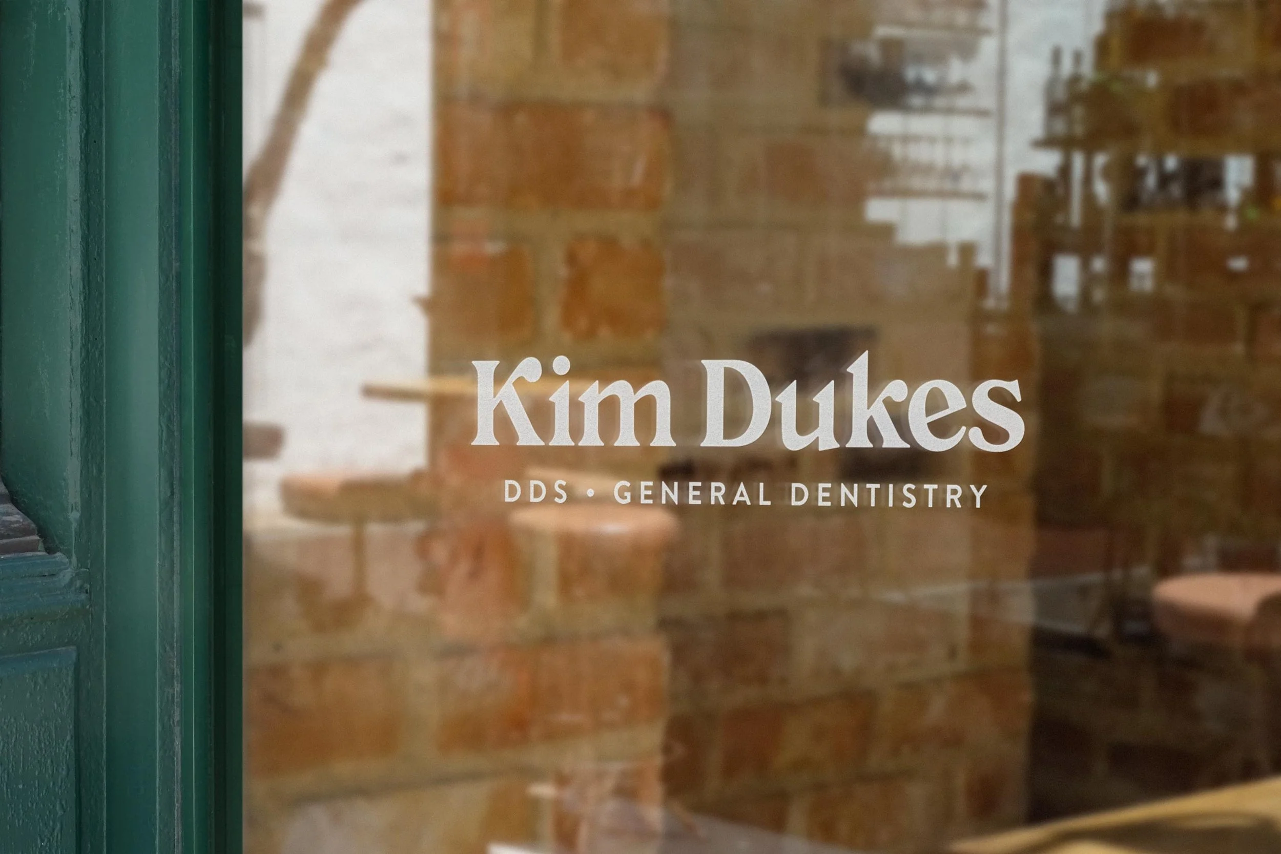
Kim Dukes, DDS
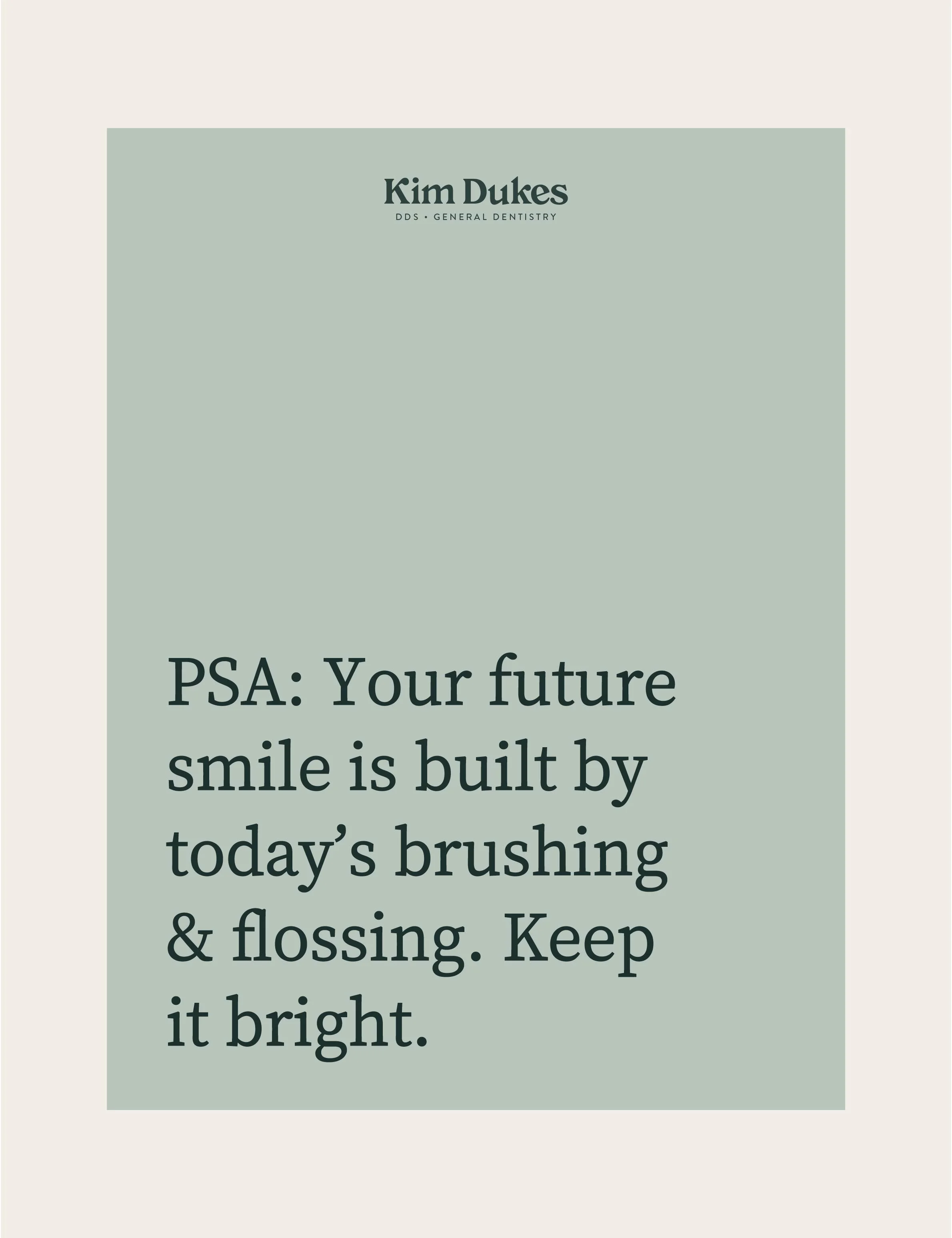
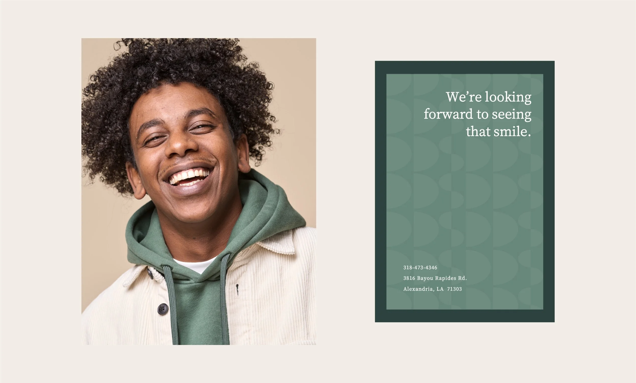
As a dentist, Dr. Kim Dukes definitely knows a thing or two about creating healthy, confident smiles. With that in mind, she wanted a visual identity that feels fresh, friendly, and modern without looking like every other dental brand. The design takes a playful turn by moving away from the usual dental color palettes and skipping predictable icons, like the classic tooth, in favor of an identity that’s unexpected.
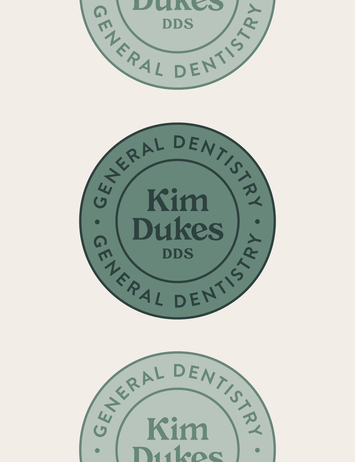
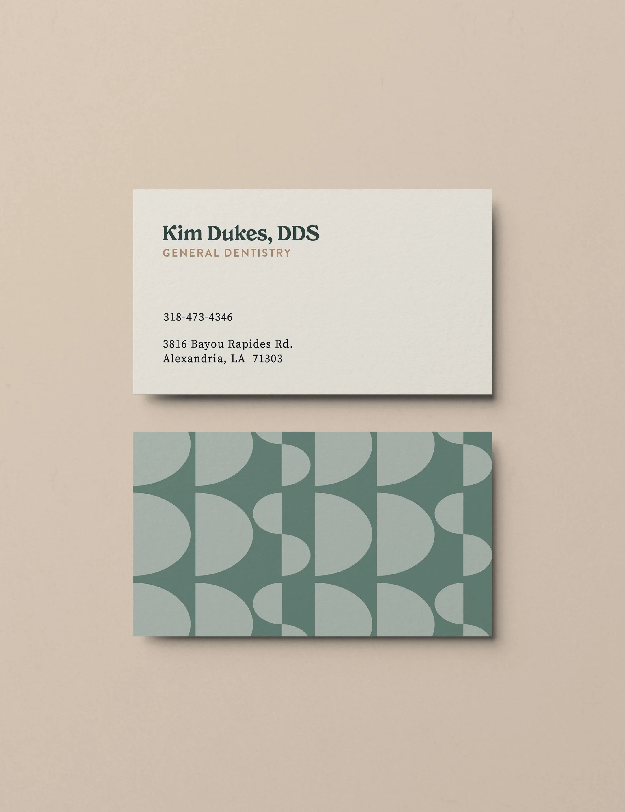
The color palette puts a fun spin on traditional dental colors to maintain a clean, fresh feel, while adding warmth and a sense of health and approachability. Geometric shapes are brought together to form “DDS,” a subtle nod to Doctor of Dental Surgery. Paired with the color palette, this intentional pattern creates a modern, friendly identity that feels unique while still maintaining a professional edge.
SERVICES
— Visual Identity
— Business Card Design


2026 AUTUMN SHIRAH